Showing posts with label product design – Produktdesign. Show all posts

Friday, 9 September 2016

For your notes

One can never have too many notebooks! I am a bit of an addict when it comes to journals, notebooks, sketchbooks … anything book-like and bound with nice papers and a beautiful cover really. So it was clear that I had to jump on the new Minted challenge about stationary gifts (personalizable notebooks, calendars and wrapping paper): the "Wrap it Up" Holiday Quickfire Gifting Challenge.

I had way too many ideas. And not enough time. I could easily have come up with more, but I finally ended up with 15 notebooks and 4 wrapping paper designs. Only ;-)
I will share my faves here with you. Like always with Minted comps, votes are very welcome – thank you!! Voting is open until September 23. (To vote, please just click on the image, that'll lead you directly to my submission on the Minted page.) To look at/ vote for ALL of my submissions, feel free to hop over here to my "Voting Now" page.

Ok, here's some of my ideas! Starting with a pretty "everyday" notebook inspired by Eastern European folklore:

http://www.minted.com/design-rating/669859
"Folkbird"

What about journaling all these precious moments, practising a bit of mindfulness? This notebook featuring a watercolour painting could be the right fit for that.

http://www.minted.com/design-rating/669511
"Floral Moments"

Recipes journals are an essential too. My design features a root pattern made with handdrawn and papercut elements – good food for your soul!

http://www.minted.com/design-rating/662881
"Soul Food Journal"

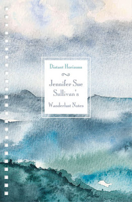
 For all travellers! This actually is one notebook out of a series of four, all featuring my watercolours and a rather classic design inspired by old travel journals and maps. You can find the other 3 on my "Voting now" page.
http://www.minted.com/design-rating/667303
"Wanderlust Notes – Distant Horizons"


Certainly, pirates need to take notes as well! For that, this playful journal for kids and the young at heart is best!

http://www.minted.com/design-rating/662917
"Pirate Clouds"


Finally, here's two wrapping paper designs for the holidays.

http://www.minted.com/design-rating/663247
"Little Forest"

http://www.minted.com/design-rating/663245
"Winternight Lace"

Hoping that you'll like my submissions! Thank you so much for looking and voting :-)

Monday, 25 January 2016

Heimtex trends 2 – "Wellbeing 4.0 – Energise"

The second theme under the main trend "Wellbeing 4.0" is called "Energise".
It is quite an opposing influence to the first "Protect" theme.
This time it's not "switch off", rather "switch on" – and energise your being!

Theme Park … Source - Messe Frankfurt Exhibition GmbH / Pietro Sutera


At the core this influence originates in using modern technology for wellbeing, for enhancing our  lifes. The offline and online worlds get more and more blurred. The internet gives us "digital dreams", offers inspiration abound and opens up larger worlds, providing us with new levels of energy.

Theme Park … Source - Messe Frankfurt Exhibition GmbH / Pietro Sutera

Theme Park … Source - Messe Frankfurt Exhibition GmbH / Pietro Sutera


Think high energy, brilliance, bold and loud designs.
A lively aesthetic, dynamic shapes and a good dose of humour too.
Colours play with contrasts, fluorescence and intense, electric shades.

Source - WGSN

Source - WGSN


Source - WGSN


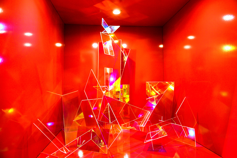
Light is used as a "material", so designs play with gloss, refractions and reflections.


Theme Park … Source - Messe Frankfurt Exhibition GmbH / Pietro Sutera


Theme Park … Source - Messe Frankfurt Exhibition GmbH / Pietro Sutera


Patterns are bold and vivacious, and sometimes kaleidoscopic.


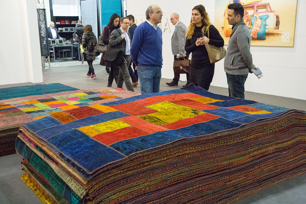
Muller-Textiel BV …
Source - Messe Frankfurt Exhibition GmbH / Jean-Luc Valentin


Abbas Nishaburi  …
Source - Messe Frankfurt Exhibition GmbH / Jochen Günther

Kayoom GmbH  …
Source - Messe Frankfurt Exhibition GmbH / Jean-Luc Valentin


From a personal view this theme is not sooo much my cup of tea … still I think accents in high colour and bold pattern can be gorgeous. If contrasted with neutrals I even like fluorescence. It really depends on the dose I guess! But ok, that's just me … there are certainly lots of people around who like it more bold! And if it really gets too much? Well ok, then switch off again ;-)

Novartiplast Italia S.p.A.  … 
Source - Messe Frankfurt Exhibition GmbH / Jochen Günther


Next post is about the "Nourish" trend theme.
To find out about the first theme "Protect", please just scroll down to my previous post.

Tuesday, 26 May 2015

MATS Bootcamp 4: Seafood for Homedecor … Meerestiere fürs Zuhause

I really don't like creepy seafood crawlies so the May assignment of MATS Bootcamp made me shiver: design a "Marine Mash Up" for plates combining crustaceans in dark colour with pretty bright patterns. But as soon as I got started I was quite enjoying my work. Weird objects are often fab to draw and to paint, and you can find something interesting in almost everything. I am calling this the "bromeliad effect" since my first MATS ;-) Back then we had to design plates for the wall with spiky and strange looking bromeliads as main motif, a project that in the end was one of my fave MATS assignments ever (you can see it here!).

You can find my seafood plate designs along with the fab work of my fellow campers in the May Bootcamp Gallery on the Lilla Rogers Studio School site here!

Ich finde Krusten-Meeresgetier wie Hummer, Krebse und Garnelen ganz schön gruselig. Deshalb hat es mich auch erstmal geschüttelt, als die Bootcamp-Designaufgabe für Mai bekannt gegeben wurde: ein "Meeres-Mix" aus dunkel gehaltenen Krustentieren und hübschen farbigen Mustern, und das alles für Teller/ Geschirr. Aber als ich mich dann mal überwunden und angefangen hatte hat mir die Arbeit daran doch Spaß gemacht. Bizarre Dinge lassen sich oft gut zeichnen und malen, und mit ein bißchen gutem Willen kann man ja eigentlich Allem interessante Seiten abgewinnen. Seit meinem ersten MATS habe ich auch einen Namen dafür: der "Bromelien-Effekt" ;-) Damals sollten wir Wandteller mit stachligen und seltsam aussehenden Bromelien als Hauptmotiv gestalten. Ein Projekt, das am Ende zu einer meiner MATS Lieblingsaufgaben gehörte (das Design ist hier zu sehen!).

Meine Krustentier-Teller finden Sie zusammen mit vielen interessanten und schönen Arbeiten meiner Camp-Kollegen in der Mai Bootcamp-Gallerie hier auf der Seite der Lilla Rogers Studio School.

For my seafood mash up I decided that it was time to do some handprinting again so I did papercuts and printed them as monoprints.
Ich hatte mich schnell entschlossen, für meinen Meeres-Mixmal wieder mit Handgedrucktem zu arbeiten. Also schnitt ich Motive in Karton und druckte sie als Monotypien.

Crustacean monoprints waiting to dry on my studio floor …
Monotypien mit Krustentieren – zum Trocknen ausgelegt


Monoprinted lobster … Hummer-Monotypie


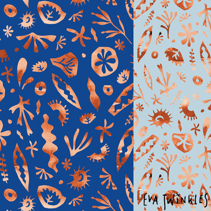
My little seacreatures pattern is made of papercuts combined with watercolours.
Für mein Muster mit den kleinen Meeresbewohnern kombinierte ich Scherenschnitt mit Aquarell.


And then I had a lot of fun putting the mash up together.
Here's the result:
Und dann hat es viel Spaß gemacht, alles zusammen zu mixen.
Hier ist das Ergebnis:


Ok, in the end I found out that I DO like crustaceans, but only as design elements please!
Ok, also mag ich Krustentiere doch! Aber bitte nur als Designelemente!

Friday, 30 January 2015

MATS Bootcamp 1: Jewel Days journals … Jewel Days Tagebücher


It's that time again: Lilla Rogers' MATS Bootcamp has started – here's my first design!
The assignment for January was to do a journal design inspired by Edwardian brooches. I quickly fell in love with the cameo jewellery that was fashionable in that period.
Here's some of my sketches of romantic Cameo ladies.

Es ist wieder soweit: Lilla Rogers' Bootcamp hat wieder angefangen – hier ist mein erstes Design!
Die Januar-Aufgabe war es, ein Tagebuchcover inspiriert von Broschen aus Edwardianischer Zeit (das entspricht unserem Jugendstil) zu entwerfen. Ich habe mich sofort in die für diese Zeit typischen Kameenbroschen verliebt.
Hier sind einige Skizzen der romantischen Kameen-Damen.

As I wanted my design to have a loose, light and romantic quality I started experimenting with watercolour and gouache. And loved these dot paintings. They look a bit like flowers which goes nicely with the romantic feel but they were initially inspired by some brooches studded with lots and lots of little glittering gems.

Mein Design sollte locker, leicht und romantisch werden, und so experimentierte ich mit Aquarellfarben und Gouache. Und blieb an diesen Tupfenmustern hängen. Sie sehen ein bißchen wie Blumen aus, was gut zur romantischen Stimmung paßt. Ursprünglich aber waren sie von Broschen inspiriert, die über und über mit glitzernden Steinen besetzt sind.


And here's one of the Cameo ladies in gouache paint …
Und hier ist eine der Kameen-Damen in Gouache …


I then assembled it all together and added some handlettering – like seen in my previous post – and my journals were ready.

Nun mußte ich nur noch alles zusammensetzen. Und es kam noch Text dazu – den Sie ja aus meiner letzten Blogpost schon kennen – und meine Tagebücher waren fertig.


Please take a look at the Bootcamp Gallery on the Lilla Rogers' Site as well! Like last year I am very much impressed by variety of interpretations and styles of my classmates. There's lots and lots of beautiful jewellery inspired designs to see!

Werfen Sie auch einen Blick in die Bootcamp Gallerie auf der Lilla Rogers' Website – es lohnt sich! Wie letztes Jahr auch schon bin ich auch diesmal ganz schön beeindruckt von all den verschiedenen Stilen und Interpretationen meiner Kommilitonen. Es gibt dort wirklich viele schöne "Schmuck"-Designs zu sehen!

Wednesday, 29 January 2014

Something nice for Valentines … ich hab' hier was für den Valentinstag!

My snap-on cases are ready! These are available now here at Keka Case featuring the designs I licensed to Keka last year. As some designs are part of my sweetest collection so far (the "Candy Forest Collection", featuring a lot of hearts) they would make perfect Valentine's gifts!

Meine snap-on Hüllen sind fertig! Sie sind jetzt über Keka Case erhältlich, mit den Designs für die ich letztes Jahr Lizenzen an Keka vergeben habe. Und weil einige der Designs zu meiner bis jetzt "herzigsten" Kollektion (der "Candy Forest Collection") gehören, sind sie als Geschenk für den Valentinstag bestens geeignet!


"Candy Circles" and "Lovebirds", snap-on cases for IPhone 5.
"Candy Circles" und "Lovebirds", snap-on Hülle für das IPhone5.


"Les Lapins" and "Candy Forest", snap-on cases for IPhone 5.
"Les Lapins" und "Candy Forest", snap-on Hülle für das IPhone5.

The snap-on cases are avaible for: iPhone 4/4s, iPhone 5, iPhone 5s and 5c, Samsung Galaxy S3 and S4, the iPad 2, 3 and 4, and for the iPad Mini.
Die snap-on Hüllen gibt es für: iPhone 4/4s, iPhone 5, iPhone 5s and 5c, Samsung Galaxy S3 and S4, den iPad 2, 3 and 4, und für den iPad Mini.

And here is one more that you could give as a present of lasting flowers:
Und hier ist noch ein passendes Design – statt Blumenstrauß:

"Jolly Garden", snap-on case for the iPad Mini.
"Jolly Garden", snap-on Hülle für den iPad Mini.


All images are courtesy of Keka Case. 
More designs are available! Go and get them here to brighten up your day!

Alle Bilder mit freundlicher Genehmigung von Keka Case.
Es gibt auch noch mehr Designs – gute Laune, die hier zu bekommen ist!

Thursday, 12 September 2013

I am a finalist! And you can be a winner, too! … Ich bin im Finale! Und Sie können auch gewinnen!

Woohoo, I am a finalist in the CarpetVista carpet design competition! Just found out they had more than 16.000 submissions from all over the world, 16.000, oh my! There are still lots of designs in the finals, but happy to be there :-) I submitted 5 designs, and these 3 carpet designs were selected:

Yippieh, ich bin im Finale des CarpetVista Teppich-Design Wettbewerbs! Gerade habe ich erfahren, daß es mehr als 16.000 Einsendungen aus aller Welt gab, unglaublich! Es sind immer noch viele Designs im Finale, aber ich bin glücklich, daß ich dabei bin :-) Ich habe 5 Designs eingereicht. Hier sind die 3 Teppichentwürfe, die ausgewählt wurden:


I am in need of your help now! The winners will be selected by public voting: please vote for my designs! (I will be forever thankful, promised!!! Plus you have the chance to win a carpet with a designs you voted for! Which makes me feel a bit better about asking for votes …
The gallery is open for voting from 12/9 to 25/10. It gives a short explanantion about the voting procedure as well. Winners will be announced on 28/10. Fingers crossed!

Jetzt brauche ich Ihre Hilfe! Die Gewinner werden durch "Public Voting" bestimmt: bitte geben Sie meinen Designs Ihre Stimme! Ich werde auf ewig dankbar sein, versprochen!!! Und Sie haben die Chance, einen Teppich mit meinem Design zu gewinnen! Was es für mich etwas leichter macht, um Stimmen zu bitten …
Die Wettbewerbsgalerie ist vom 12.9. bis zum 25.10. zum Abstimmen geöffnet. Sie finden dort auch eine kurze Erklärung zum Ablauf der Abstimmung. Die Gewinner werden am 28.10. verkündet. Daumen drücken!

Here are my designs with a link for voting - and for winning the respective carpet(You can vote for up to 5 designs and as well choose the colourversion you like best.) 
Und hier sind meine Designs mit dem jeweiligen Link für die Abstimmung - und für den Gewinn dieses Teppichs(Sie können für maximal 5 Designs abstimmen und auch auswählen, welche Farbstellung Ihnen am besten gefällt).


Lace Wood (link)


Lace Wood is very much the portrait of my surroundings. I live in the Lahn River Valley in Germany and it's densely wooded hills are very inspiring to me. With the change of weather, light and season they can be soft and beautiful or dark and mysterious. 
General inspiration: nature, romantic, old tales.
Old gold palette: mysterious, rich and glowing.
Light blue palette: soft, peacefull, meditative.
As a carpet design "Lace Wood" brings nature into our homes and takes you on a magical walk through the forest.

Lace Wood ist ein Portrait meiner Heimat. Ich lebe im Lahntal, und die dicht bewaldeten Hänge der Lahn inspirieren mich sehr. Je nach Wetter, Licht und Jahreszeit können sie sanft und lieblich oder auch dunkel und geheimnisvoll wirken. 
Grundlegende Inspiration: Natur, Romantik, Sagen und Märchen.
Altgoldene Farbpalette: geheimnisvoll, satt und leuchtend.
Hellblaue Farbpalette: weich, ruhig und meditativ.
Als Teppichdesign bringt "Lace Wood" die Natur ins Haus und lädt Sie zu einem magischen Waldspaziergang ein.


Magic Feathers (link)


Whilst creating the "Magic Feathers" design I was workig on the theme of  "flying" – this led to the feather motifs. Feathers as gifts from the sky, signifying honor. Connecting us to the birds and the gods of the sky.
General inspiration: nature, ethnic, tribal, midcentury.
Emerald palette: earthy, yet fresh, with a touch of mystical.
Sorbet palette: soft and meditative. 
I love to see this design on a carpet – who wouldn't love to own a flying carpet? 


Meine "Magic Feathers" sind entstanden, als ich an Designs zum Thema "fliegen" gearbeitet habe – was mich zu den Federmotiven geführt hat. Federn als Geschenk aus den Lüften, als Symbol für Ehre. Federn, die uns mit den Vögeln und den Göttern der Lüfte verbinden.
Grundlegende Inspiration: Natur, ethno, tribal, 50ger Jahre.
Smaragdgrüne Farbpalette: erdverbunden, aber dennoch frisch, mit einer Prise Mystik.
Sorbetfarbene Palette: sanft und meditativ.
Die Umsetzung dieses Designs als Teppich gefällt mir besonders gut – wer hätte nicht gern einen fliegenden Teppich?


Rambling (link)


Starting point of my "Rambling" design was a seed pod drawing. This led to a whole collection of patterns around the growing and rambling power of nature. I love the thought of nature overgrowing our world, as well as the idea of bringing the power of nature into our homes with this carpet design …
General inspiration: nature, growing, japan, midcentury.
Pink palette: powerful yet tender, inspired by japanese cherry blossoms.
Dark green palette: jungle – dark, mysterious and full of energy.

Der Ausgangspunkt für mein "Rambling" Design war die Zeichnung einer Samenkapsel. Daraus hat sich eine ganze Kollektion entwickelt, die das Wachsen und Wuchern der Natur zum Thema hat. Die Vorstellung, daß unsere Welt von Pflanzen überwuchert wird, finde ich sehr reizvoll! Ebenso wie den Gedanken, mit diesem Teppichdesign die Natur ins Haus zu holen …
Grundlegende Inspiration: Natur, Wachstum, Japan, 50ger Jahre.
Pinke Farbpalette: kraftvoll und gleichzeitig zart, inspiriert von japanischen Kirschblüten.
Dunkelgrüne Farbpalette: Urwald – dunkel, geheimnisvoll und voller Energie.


Really hope you like these carpets! Thanks so much for voting :-) And fingers crossed for you as well, it would make me so proud if you would win one of my carpets!
Ich hoffe, die Teppiche gefallen Ihnen! Vielen Dank für Ihre Stimme :-) Und ich drücke auch Ihnen die Daumen – es würde mich wirklich sehr stolz machen, wenn Sie einen meiner Teppiche gewinnen würden!

Saturday, 9 February 2013

Passagen: Design Quartier Ehrenfeld

January was definitely the "month of fairs" – here am I again at Passagen (passages) in Cologne.
Der Januar war definitiv mein "Messemonat" – hier bin ich jetzt auf der Passagen in Köln.

Running parallel to the International Furniture Fair IMM Passagen presents product and interior design by newcomers and design stars in more than 190 venues throughout the city. I was most interested in the "Design Quartier Ehrenfeld", as this promised to be innovative indie design. Ehrenfeld is a former working quarter. In the 90ties designers and artists started to move in because of cheap and ample spaces for studios and workshops. Today, Ehrenfeld sports a dense "design population" and an interesting mix of creatives.
The main events in Ehrenfeld were held at the "Heliosfabrik", a former industrial space. It is a landmark, too, because of it's lighthouse – Cologne's one and only lighthouse. Cologne is more than 200 km away from the coast ;-) … but that's another story for another blogpost!

The Heliosfabrik in Cologne with it's lighthouse …
die Heliosfabrik in Köln mit ihrem Leuchtturm


Die Passagen werden parallel zur Internationalen Möbelmesse IMM abgehalten und zeigen Produkt- und Interiordesign von Newcomern und von Stardesignern an mehr als 190 Veranstaltungsorten quer durch die ganze Stadt. Mich hat das "Design Quartier Ehrenfeld" besonders interessiert, denn das hörte sich nach innovativem Indie-Design an. Ehrenfeld war früher eine Arbeiter- und Industriestadt. In den 90zigern wurden die günstigen und großen Gebäude Stück für Stück von Designern und Künstlern bezogen und zu Studios und Werkstätten umgewandelt. Heute besitzt Ehrenfeld eine große  "Design-Bevölkerungsdichte" – ein interessanter Mix von Kreativen hat sich entwickelt. 
Die Hauptveranstaltungen in Ehrenfeld fanden in der "Heliosfabrik" statt, einem früheren Fabrikgebäude. Die Fabrik ist auch ein Wahrzeichen, wegen ihres Turms – Kölns einzigem Leuchtturm. Köln ist mehr als 200 km von der Küste entfernt ;-) … aber da geraten wir jetzt schon in eine andere Geschichte und in eine andere Blogpost!

Back to "Passagen": Here we are at the hall of "Heimatdesign" – an agency that supports and sells local designers from the Ruhr region.
Zurück zu den "Passagen": Das hier ist die Halle von "Heimatdesign" – einer Agentur, die Designer aus dem Ruhrgebiet unterstützt und vermarktet.


I loved the quirky tableware on legs and these wood veneer postcards that can be folded into little sculptures.
Besonders gefallen haben mir das witzige Geschirr auf Beinen und diese Holzfurnierpostkarten, die man zu kleinen Skulpturen falten kann. 


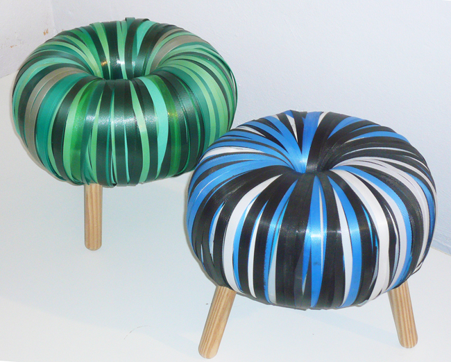
These two "pouf pouf" stools made from recycled straps were part of the "Best of Recycling Design Preis" exhibition.
Diese beiden "pouf pouf" Hocker aus recycelten Gurten waren Teil der "Best of Recycling Design Preis" Ausstellung.


Time for a break … loved that original food van from the 50ties!
Zeit für eine Pause … ist dieser original 50ger-Jahre-Imbisswagen nicht genial!?


The following pics are my selection from "Designer's Fair", the biggest hall:
Und hier kommt meine Auswahl aus der größten Halle, der "Designer's Fair".


"fontlove" by Nogallery.
I've always been fascinated by words and loved these wooden "room sculptures". More than 300 words are available in different fonts, sizes and colours. That pink word "Freude" (= joy) now adorns my desk!
"fontlove" von  Nogallery.
Worte haben mich schon immer fasziniert. Und deshalb gefallen mir natürlich auch die hölzernen "Raumskulpturen" besonders gut. Es gibt mehr als 300 Wörter in verschiedenen Fonts, Größen und Farben. Die pinke "Freude" steht jetzt auf meinem Schreibtisch!


Interesting constructed "couchpotato" cushions and "lamp ignon" lamps by textile and product designer Meike Harde. We had already seen her work at Heimtextil in Frankfurt.
Interessant konstruierte "Couchpotato" Kissen und "lamp ignon" Lampen von der Produkt- und Textildesignerin Meike Harde. Ihre Arbeiten konnten wir schon auf der Heimtextil bewundern.


These stools by "statthocker" are made from discarded street lamps!
Diese Hocker von "statthocker" werden aus ausrangierten Straßenlaternen gemacht!


And here's another example of fab recycling: a "bird table station" by Greimdesign.
Noch ein Beispiel für gutes Recycling: die "Vogelfutterstation" von Greimdesign.


Fine quality and fun ideas by Njustudio
"Hansi", a "giant bird mirror" … puts a grin on the face of anyone like me who owned a lonely budgie or canary as a child! Fab for all modern "twitterers" as well! Look closely - can you spot the budgie? 
"Stromer" – a "power servant"
and the little "Top Gir" candleholder. 

Feine Qualität and witzige Ideen vom Njustudio
"Hansi", ein "Riesen Vogelspiegel" … da muß doch eigentlich jeder grinsen, der wie ich als Kind einen einsamen Wellensittich oder Kanarienvogel besaß! Sehr schön auch für all die modernen "Twitterer"! Genau hinschauen! – Können Sie Hansi sehen?
"Stromer" – ein "Strom Diener"
und der kleine "Top Gir" Kerzenständer.


This Gugelhupf lamp is called "Rosi"! 
By Martin Neuhaus, who designs "products à la maison".
Diese Gugelhupf-Lampe heißt "Rosi"!
Von Martin Neuhaus, der "Produkte nach Art des Hauses" designt.


And I as well loved this speech bubble lamp called "blub" by Christian Lessing.
Die Sprechblasenlampe "blub" von Christian Lessing hat mir natürlich auch gut gefallen.


And finally here is what had to be my fave! By Christian Lessing as well: A silhouette sculpture made from steel. It reads: "Thinking makes you fat". Ok! NOW I finally know where my extra pounds come from!
Und zum Abschluß  kommt hier eine kleine Skulptur, die einfach mein Liebling werden mußte! Auch von Christian Lessing: eine Scherenschnittsfigur aus Stahl. Ok! JETZT weiß ich auch endlich, wo meine überflüssigen Pfunde herkommen!