Showing posts with label Placement design. Show all posts

Tuesday, 26 May 2015

MATS Bootcamp 4: Seafood for Homedecor … Meerestiere fürs Zuhause

I really don't like creepy seafood crawlies so the May assignment of MATS Bootcamp made me shiver: design a "Marine Mash Up" for plates combining crustaceans in dark colour with pretty bright patterns. But as soon as I got started I was quite enjoying my work. Weird objects are often fab to draw and to paint, and you can find something interesting in almost everything. I am calling this the "bromeliad effect" since my first MATS ;-) Back then we had to design plates for the wall with spiky and strange looking bromeliads as main motif, a project that in the end was one of my fave MATS assignments ever (you can see it here!).

You can find my seafood plate designs along with the fab work of my fellow campers in the May Bootcamp Gallery on the Lilla Rogers Studio School site here!

Ich finde Krusten-Meeresgetier wie Hummer, Krebse und Garnelen ganz schön gruselig. Deshalb hat es mich auch erstmal geschüttelt, als die Bootcamp-Designaufgabe für Mai bekannt gegeben wurde: ein "Meeres-Mix" aus dunkel gehaltenen Krustentieren und hübschen farbigen Mustern, und das alles für Teller/ Geschirr. Aber als ich mich dann mal überwunden und angefangen hatte hat mir die Arbeit daran doch Spaß gemacht. Bizarre Dinge lassen sich oft gut zeichnen und malen, und mit ein bißchen gutem Willen kann man ja eigentlich Allem interessante Seiten abgewinnen. Seit meinem ersten MATS habe ich auch einen Namen dafür: der "Bromelien-Effekt" ;-) Damals sollten wir Wandteller mit stachligen und seltsam aussehenden Bromelien als Hauptmotiv gestalten. Ein Projekt, das am Ende zu einer meiner MATS Lieblingsaufgaben gehörte (das Design ist hier zu sehen!).

Meine Krustentier-Teller finden Sie zusammen mit vielen interessanten und schönen Arbeiten meiner Camp-Kollegen in der Mai Bootcamp-Gallerie hier auf der Seite der Lilla Rogers Studio School.

For my seafood mash up I decided that it was time to do some handprinting again so I did papercuts and printed them as monoprints.
Ich hatte mich schnell entschlossen, für meinen Meeres-Mixmal wieder mit Handgedrucktem zu arbeiten. Also schnitt ich Motive in Karton und druckte sie als Monotypien.

Crustacean monoprints waiting to dry on my studio floor …
Monotypien mit Krustentieren – zum Trocknen ausgelegt


Monoprinted lobster … Hummer-Monotypie


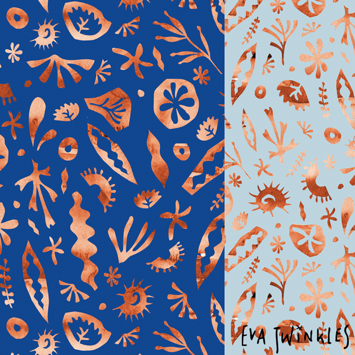
My little seacreatures pattern is made of papercuts combined with watercolours.
Für mein Muster mit den kleinen Meeresbewohnern kombinierte ich Scherenschnitt mit Aquarell.


And then I had a lot of fun putting the mash up together.
Here's the result:
Und dann hat es viel Spaß gemacht, alles zusammen zu mixen.
Hier ist das Ergebnis:


Ok, in the end I found out that I DO like crustaceans, but only as design elements please!
Ok, also mag ich Krustentiere doch! Aber bitte nur als Designelemente!

Monday, 13 April 2015

School's out! (MATS B, week 1+2) … Die Schule ist aus! (MATS B, Woche 1+2)

Border Design for a Kid's Collection, week 2 … Entwurf einer Bordüre für eine Kinderkollektion, Woche 2

I had gone back to school for 5 weeks of Make Art That Sells (MATS B). I loved it but realized quickly that for my current life/ work circumstances the slower MATS Bootcamp pace is the far better fit … oh my … (In the MATS course itself you'll do one assignment for one illustration market per week. In Bootcamp you'll do one assignment per month.)
Nevertheless I have enjoyed MATS B. The assignments were awesome and Lilla Rogers is a fantastic teacher. I have done some work I like and even if some (lots) of it is not completed yet I will certainly finish it up later on. As well there's the international community of artists coming together for these courses – always great and supportive and simply invaluable. Got to know a lot of fab people and picked up some nice tricks along the way, so no regrets :-)

I was a bit unsure at first – should I show any unfinished work?  … but then I thought ok, it won't hurt, so here it goes!

Placement Design for a Kid's Collection, week 2 … Einzelmotif für eine Kinderkollektion, Woche 2

Für 5 Wochen Make Art That Sells (MATS B) habe ich wieder die Schulbank gedrückt. Und das sehr gerne, aber ich mußte auch schnell feststellen, daß das langsamere MATS Bootcamp-Tempo für meine Lebens-/Arbeitssituation im Moment sehr viel angemessener ist … oh jeh … (Im MATS Kurs selbst bekommt man pro Woche eine Aufgabe für einen der Märkte für Illustration. Im Bootcamp ist es eine Aufgabe pro Monat.)
MATS B hat mir trotzdem viel Spaß gemacht. Die Aufgaben waren genial und Lilla Rogers ist eine fantastische Lehrerin. Ich habe ein paar gute Arbeiten produziert. Manches (vieles) ist unvollendet, aber ich werde es sicher später fertigmachen. Außerdem ist die internationale Gemeinschaft der Kreativen, die für diese Kurse zusammenkommt, immer großartig und aufbauend und ganz einfach unbezahlbar. Ich habe viele interessante Leute kennengelernt und auch ein paar gute Tricks mitbekommen, und so hat es sich auf jedenfall gelohnt.

Ich war mir ja erst etwas unsicher – sollte ich hier unvollendete Arbeiten zeigen? … aber auf der anderen Seite kann es ja auch nicht wirklich schaden … also geht es hier los:

Week 1: Paper
There's not so much to say about me in the first week … apart from that I now have some nice ideas and sketches to work with further on. Week one was all about the paper market, and the assignment was doing a Christmas card with the theme of toy trains. 
Woche 1: Papierwaren
Hier kann ich garnicht viel erzählen … außer das ich ein paar interessante Ideen und Skizzen mitnehme, die ich später weiterentwickeln kann. Unsere Aufgabe war es, eine Weihnachtskarte mit dem Thema Spielzeug-Züge zu gestalten.

Week 2: Baby Apparel 
For this we had to create a collection inspired by seaweed and seahorses. I especially enjoyed painting seaweed – it comes in so many fascinating forms and colours! Here are some of my icons:
Woche 2: Kinderkleidung
Dafür sollten wir eine Kollektion entwickeln, die von Seepferdchen und Algen inspiriert sein sollte. Vor allem die Algen haben mir viel Spaß gemacht  – es gibt da soviele faszinierende Formen und Farben! Hier sind ein paar meiner Motive:

With all these weeds I had the idea of an underwater garden. And of a little gardener and some creatures to play in the garden.
Mit all diesen Gewächsen kam mir die Idee für einen Unterwasser-Garten. Und für eine kleine Gärtnerin und ein paar Kreaturen, die im Garten spielen können.

Seahorse Garden Main Placement … Seahorse Garden Hauptmotiv

I myself will certainly play on with these designs later on!
P.s.: Week 3 soon to follow …
Ich selbst werde mit den Entwürfen sicher später "weiterspielen"!
P.s.: Es geht bald weiter mit Woche 3 …

Monday, 25 August 2014

"Artists around the world" bloghop

Now it's my turn now in this bloghop, linking artists around the world :-) We have been asked 4 questions about our work and work process and post our answers on our blogs, then linking up to the next artists.

Let me quickly introduce myself first, I am Eva Marion Seyffarth, a surface designer and illustrator from Germany working under the studio name "Eva twinkles".

I have been invited to this hop by my friend and collague Vivayne, a freelance artist from Las Vegas. Please check out her lovely work here and blog here!
Here's a set of plates she did, which I love for it's softness and dreamy atmosphere:

"A joyous time", copyright Vivayne.


And here are my answers to the 4 bloghop questions:

1. Why do I do what I do?
Well I felt drawn to be an illustrator and designer as long as I can think. The creative process is something that comes very naturally to me, creating is just what I do, as simple as that. But if you dig deaper I guess it's mostly the freedom that comes with it: you get to create your own world, and I LOVE that.

2. How does my work differ from others of its genre?
Ok, the good old style question … I think what sets me apart is textures and translucency. It's as well my foundation in traditional art, married together with all the digital possibilities we have nowadays. I am a very haptic person and love to make a mess with paint or handprinting techniques. I have a background in handprinting, and have been painting with watercolours since childhood. My father is a landscape watercolour painter and often took me out on painting trips into the forest or the fields, and  I guess that really has shaped me.
On subject matter, I am mostly inspired by nature – often by organic structures in plants and landscape but as well by flora and fauna and landscape in general. Next biggest inspiration is words, storytelling and folk tales.

"Seed", plate design, part of the "Essential Garden" collection,
done with monoprints + Illustrator

Papercut motifs, which then were monoprinted
and used for the "Essential Garden" collection


3. How does my creative process work?
Like said above, I always start by hand, with pen on paper or scissors or paint or printing ink. I nowadays work with gouache rather than with watercolour as the colours are more saturated and I love that you can go from translucent to pastose colours with it. When it comes to printing, I often work with papercuts and print them as monoprints. I am a classic case when it comes to sketchbooks too. I take mine everywhere with me, and scribble down ideas or inspirational stuff. Very often it's a sketch from my sketchbook that is the starting point for my work. I usually just start working on single motifs and bits that come to my mind for my theme till I get to saturation point. I then scan everything in and do my composition and additional elements in Photoshop and/or Illustrator.

"Moonseeds", seed pot drawings in my sketchbook


Painting with gouache for the "Folk Song" collection

Plate design for the "Folk Song" collection


4. What am I working on now?
I have just finished my piece for the first round of Lilla Roger's Global Talent Search. Unfortunately I can't show the piece yet … but you can see some work in progress pics in my previous blogpost.
I am as well working on editorial illustrations, to build up my portfolio. Doing Lilla Rogers' MATS courses has rekindled my love of this field and I would like to get more commissions in that market.
Last but not least I am working on a makeover of my website. So much has happened since I first published it about a year ago! My work has changed and evolved to be more "me" and I will be tearing down almost all the pieces I had on the site, replacing them with new work. It's totally scary, but feels good too. It's about time!


Why do we garden? Editorial Illustration
for an article about gardening in the city


And now let's travel on up to the north of Europe … please check in on the following monday, the first of September, to see what my collagues from Scandinavia have to say on their blogs!

Sanna Väätänen is a painter, photographer and illustrator from Finland. I love this inventive cuckoo clock design that she has done for a phone cover, it is a witty and very unique interpretation of the theme:

Cuckoo Clock Phone Cover, copyright Sanna Väätänen


See more of her illustrations here and please check in at Sanna's blog for her "Artists around the world" post on the first of September!

Simi Gauba is a pattern and product designer originally from India, but now based in Sweden. Here's a print that is available in her Society 6 store – I have to tell you it was a difficult choice, there's so much beautiful designs in that shop! But I especially love this print for it's boldness and inventive typography:

"Be Brave" art print, copyright Simi Gauba


Please make sure to take a look at the Simidesign blog for more beautiful things to see and for Simi's  "Artist's around the world" post on the first of September!

Thank you for visiting!

P.s.: You'd like to read more blogposts of this hop and to meet more creative souls form all over the world? Tasha Goddard is collecting them here on her blog, please take a look! Thanks Tasha for creating this linky, it's a fab idea, and I will sure be browsing the links as well!

Wednesday, 26 February 2014

MATS Bootcamp 1: Welcome to the Blackforest! … Willkommen im Scharzwald!


Have you ever been to the Blackforest in Germany? I've just returned from there! That is because I am doing Lilla Rogers' Assignment Bootcamp, which is a series of monthly briefings across different Surface Design/Illustration markets. The first assignment for February was … cuckoo clock designs! We were briefed to do a design based on cuckoo clocks for phone cases. I fell in love with the theme right away and because cuckoo clocks initially come from the Blackforest region I was looking into inspiration from Blackforest folklore in general. Here are some sketches I managed to squeeze in here and there. Loved working on it! 

Waren Sie schon mal im Schwarzwald? Ich komme gerade von dort zurück. Ich nehme nämlich an Lilla Rogers' Assignment Bootcamp teil, einer Serie von monatlichen Briefings quer durch die verschiedenen Märkte für Surface Design und Illustration. Und die erste Aufgabe für Februar war … Kuckucksuhrdesigns! Wir wurden gebrieft, ein Design für Handytaschen zum Thema Kuckucksuhren zu entwerfen. Ich fand das Thema gleich genial, und weil die Kuckucksuhren ursprünglich aus dem Schwarzwald kommen, habe ich mir meine Inspiration aus der Schwarzwald-Folklore geholt. Hier sind ein paar Skizzen, an denen ich immer mal wieder ein bißchen arbeiten konnte. 


I had to do the final design pretty quickly for lack of time, but still I like it. There's just so many possibilities for cute and quirky imagery within that theme! I will certainly revisit … maybe my design is going to be extended into a german folklore collection …

Für das eigentliche Design mußte ich dann sehr fix sein, wie so oft fehlte mir einfach die Zeit. Trotzdem bin ich ganz zufrieden damit. Das Thema bietet einfach soviele Möglichkeiten für schöne und witzige Motive! Ich werde mich da sicher nochmal dransetzen … vielleicht wird aus dem Design eine ganze Folklore-Kollektion?


Fancy more cuckoo clocks? There's lots and lots of them! You can find them here, in the Bootcamp gallery! 
And me, I am wondering now, where will I travel to next Bootcamp month?

Mehr (viel mehr!) zum Thema Kuckucksuhren gibt es hier zu sehen, in der Bootcamp Galerie! 
Und ich frage mich nun, wohin ich wohl im nächsten Bootcamp-Monat reisen werde?

Wednesday, 29 January 2014

Something nice for Valentines … ich hab' hier was für den Valentinstag!

My snap-on cases are ready! These are available now here at Keka Case featuring the designs I licensed to Keka last year. As some designs are part of my sweetest collection so far (the "Candy Forest Collection", featuring a lot of hearts) they would make perfect Valentine's gifts!

Meine snap-on Hüllen sind fertig! Sie sind jetzt über Keka Case erhältlich, mit den Designs für die ich letztes Jahr Lizenzen an Keka vergeben habe. Und weil einige der Designs zu meiner bis jetzt "herzigsten" Kollektion (der "Candy Forest Collection") gehören, sind sie als Geschenk für den Valentinstag bestens geeignet!


"Candy Circles" and "Lovebirds", snap-on cases for IPhone 5.
"Candy Circles" und "Lovebirds", snap-on Hülle für das IPhone5.


"Les Lapins" and "Candy Forest", snap-on cases for IPhone 5.
"Les Lapins" und "Candy Forest", snap-on Hülle für das IPhone5.

The snap-on cases are avaible for: iPhone 4/4s, iPhone 5, iPhone 5s and 5c, Samsung Galaxy S3 and S4, the iPad 2, 3 and 4, and for the iPad Mini.
Die snap-on Hüllen gibt es für: iPhone 4/4s, iPhone 5, iPhone 5s and 5c, Samsung Galaxy S3 and S4, den iPad 2, 3 and 4, und für den iPad Mini.

And here is one more that you could give as a present of lasting flowers:
Und hier ist noch ein passendes Design – statt Blumenstrauß:

"Jolly Garden", snap-on case for the iPad Mini.
"Jolly Garden", snap-on Hülle für den iPad Mini.


All images are courtesy of Keka Case. 
More designs are available! Go and get them here to brighten up your day!

Alle Bilder mit freundlicher Genehmigung von Keka Case.
Es gibt auch noch mehr Designs – gute Laune, die hier zu bekommen ist!

Friday, 20 December 2013

MATS Week 5: A hyper-lush Final … Ein hyper-opulentes Finale


In the final week of MATS part A we were working for the gift market. A large and very interesting market! Our assignment was to do a zipper bag (plus 2-3 coordinating pieces optionally) with a hyper-lush design. Hyper-lush is a trend that Lilla sees migrating from fashion down into the gift market. It basically means to throw lots of things together, and to go wild with form, colour and medium. To create a piece that gives the eye lots and lots (too much?) to see, a piece with visual opulence.
Here's the story: Our mini was to gather things we collect, and take pictures or draw these as motifs for our design. I am not a collector, often I like different things that don't really match, but it was fun to sift through my stuff, looking for inspiration. I settled on an underwater scene. I love the ocean and have gathered lots of shells and starfish over the years, as well as some little ornaments like fish and a glass seahorse. I am as well fascinated by all things pearly and glittery, like glass prisms, glitter balls, little pearls and so on. As I had a mad schedule in that week, I had to speed up the process and didn't draw anything. All the icons in this design are photographs or things scanned in or vintage illustrations, combined and manupulated in Photoshop.

In der letzten Woche von MATS, Teil A haben wir uns mit der Geschenke-Branche beschäftigt. Ein großer und sehr interessanter Markt! Unsere Aufgabe war es, ein Täschchen für Kleinigkeiten (und wenn wir wollten, 2-3 dazu passende Produkte) mit einem hyper-opulenten Design zu gestalten. Hyper-Opulenz ist ein Trend, von dem Lilla glaubt, daß er sich von der Mode bis in die Geschenke-Branche ausbreiten wird. Grundsätzlich heißt das, ganz viele Elemente zusammen zu mixen, und es mit Formen, Farben und dem Medienmix zu übertreiben – sodaß ein Design mit visueller Opulenz entsteht, das dem Auge sehr sehr viel (zuviel?) zum Anschauen gibt.
Für unsere Mini-Aufgabe sollten wir Dinge zusammensuchen, die wir sammeln, und diese als Motive für unser Design fotografieren oder einscannen oder zeichnen. Ich bin keine wirkliche Sammlerin, mir gefallen die verschiedensten Dinge, aber es hat Spaß gemacht, meinen Krimskrams nach Inspiration zu durchforsten. Ich habe mich dann für eine Unterwasser-Szene entschieden. Ich liebe das Meer und habe über die Jahre viele Muscheln und Seesterne zusammengesammelt, und auch ein paar Fischfiguren und ein Glas-Seepferdchen. Und ich mag auch alles was schimmert und glänzt und nach Perlmutt aussieht, wie z.B. Glasprismen, Discokugeln, kleine Perlen und so weiter. Und weil ich in dieser Woche eigentlich überhaupt keine Zeit hatte, mußte ich diesmal besonders schnell arbeiten und habe deshalb nichts gezeichnet. Alle Elemente in diesem Design sind entweder fotografiert oder eingescannt oder es handelt sich um Vintage-Illustrationen, alles mit Photoshop zusammengebaut und verändert.


I'll have to admit that I wasn't so happy with this theme at first. But I quickly realized that it is very fun to exaggerate. And the outcome? Well, I am still not sure if I like my design. I feel it is either cool or downright horrible … depending on my mood … Anyway, this assignment gave me lots of ideas to try out later on: integrating photography is something I want to explore further, as well as mixing different mediums and designing with vintage ephemera.
I was sad and relieved at the same time that part A was over now. Like Lilla says herself, it is a bootcamp. It takes over your life. I absolutely loved every minute of it – and now I need some time to digest it all! But I am happy that it's not really over yet… there's part B in Spring 2014 to look forward to :-)
If you want to read all my blogposts about the 5 MATS weeks, you can go here for week 1, week 2, week 3, and week 4. And the MATS tribe did a blogtour about the course – find the participants plus links here and my blogtour post here. Hope you'll enjoy reading about it!

Ich muß zugeben, daß mir das Thema erst so garnicht zugesagt hat. Allerdings habe ich schnell gemerkt, daß es schon Spaß macht, zu übertreiben. Und das Ergebnis? Na ja, ich bin mir einfach immer noch nicht sicher, ob ich mein Design gut finde … je nach Laune finde ich es manchmal cool und manchmal ganz schrecklich … Auf jedenfall hat die Woche mir aber neue Ideen geliefert, die ich weiter ausprobieren möchte: Fotografie in meine Designs einbinden, und ebenso Vintage–Illustrationen und Drucke.
Und dann war es vorbei. Ich war froh und traurig zugleich … Lilla selbst sagt ja, daß dieser Kurs ein Bootcamp ist. Das Leben an sich findet einfach nicht mehr statt. Ich habe jede Minute davon genossen – und jetzt brauche ich Zeit, um das alles zu verdauen. Aber ich freue mich, daß es doch noch nicht so richtig vorbei ist: im Frühjahr 2014 kommt MATS, Teil B :-)
Wenn Sie alle meine Blogposts über die MATS-Wochen lesen möchten, finden sie hier die 1. Woche, die 2. Woche, die 3. Woche und die 4. Woche. Und die MATS-Crew hat eine Blogtour über den Kurs gemacht – hier sind die Teilnehmer und ihre Links und hier ist meine Blogtour-Post. Viel Spaß beim Lesen und Anschauen!

Wednesday, 4 December 2013

MATS - Week 2: Bromeliads are beautiful … 2.Woche: Bromelien sind schön


Dear readers, if you are joining me from the MATS blog tour … you can find my blogtour post here!

This post here is all about the second week of MATS – with focus on Home Decor. I was really looking forward to it. Until I knew what we were supposed to do as mini exercise. Bromeliads :-( Well, I love plants and nature but in Surface Design there are flowers everywhere and you can get a bit fed up with florals. And I remembered Bromeliads as the kind of flowers my mother would grow on her living room flower window … Little did I know! After a research on Bromeliads via Pinterest I realized that there's sooo many varieties out in the wild and lots of them look just amazing. They are weird, spiky, colourful, expressiv and very beautiful. You can have a look for yourself at my Pinterest board here.

In der zweiten MATS-Woche ging es um Home Decor – Zuhause und Wohnen. Darauf hatte ich mich schon sehr gefreut. Bis ich dann erfuhr, um was es bei unserer Mini-Übung ging: um Bromelien :-( Klar, an sich liebe ich Blumen und Pflanzen, aber beim Surface Design hat man ständig damit zu tun und manchmal hat man von Floralem einfach die Nase voll. Außerdem dachte ich sofort an das Blumenfenster meiner Mutter – Bromelien schienen mir genau die Art von Pflanzen zu sein, die da perfekt aussehen würden … falsch gedacht! Nachdem ich ein bißchen auf Pinterest recherchiert hatte, wurde mir klar, daß es "in freier Wildbahn" unendlich viele Bromelien-Arten gibt und daß die meisten einfach faszinierend sind. Sie sind eigenartig, stachlig, farbenfroh, ausdrucksstark und sehr schön. Wer Lust hat, kann hier mal einen Blick auf mein Pinterest-Board werfen. 

Sketching Bromeliads … Bromelien zeichnen 


More Bromeliads: reed pen, watercolour and gouache paint … 
Noch mehr Bromelien: Rohrfeder, Aquarell und  Gouache


Newly inspired I started to explore the Bromeliads through sketching. I tried out a lot of materials, including my good old reed pen and brush and paint. I liked what I did, but was still looking for a way to do justice to these plants: to their weirdness and rustic feel and their amazing forms. Following a sudden idea, I did a simple papercut and yes, I loved that! The expressiv forms called for some interesting textures and at first, I planned to add textures digitally. But then a second idea made me try out monoprints with the papercuts. Loved that even better! The prints really had the feeling I was looking for and fitted well with the character of the plants. I went into a real printing frenzy (I love handprinting), just couldn't stop! Below are just two examples, there's many …

Neu inspiriert machte ich mich ans Werk, und zeichnete Bromelien. Ich habe so einiges an Materialien ausprobiert, auch meine gute alte Rohrfeder und Pinsel und Farbe. Das Ergebnis gefiel mir schon, aber ich suchte immer noch nach dem richtigen Weg, den Planzen gerecht zu werden: ihrer Eigenartigkeit, ihrer rustikale Anmutung und ihren ungewöhnlichen Formen. Dann hatte ich eine plötzliche Eingebung: Scherenschnitte! Ja, das schien mir gut zu passen. Zu den ausdrucksstarken geschnittenen Formen paßten Strukturen gut, und zuerst wollte ich diese am Computer einbauen. Aber dann kam die zweite Eingebung: ich machte Monotypien von den Scherenschnitten! Das gefiel mir noch besser. Die Drucke drückten genau das aus, was ich im Sinn hatte, und paßten gut zum Charakter der Pflanzen. Ich bin in einen regelrechten Druck-Rausch verfallen (ich liebe Originaldrucke) und konnte garnicht mehr aufhören. Unten sind nur mal zwei Beispiele davon, ich habe sehr viel mehr …

My first papercut … mein erster Scherenschnitt

Monotype print … Monotypie

Monotype print … Monotypie


On wednesday, the big assignment was released: design a collection of 2-4 plates featuring bromeliads for a customer like Anthropologie. A dream assignment! I felt I had my icons ready to go, started scanning them in and worked on some compositions in Illustrator. Below is a work in progress screenshot, with my first colour scheme still.

Am Mittwoch bekamen wir dann den großen Auftrag für die Woche: wir sollten eine Kollektion von 2-4 Tellern designen, für einen Kunden wie z.B. Anthropologie. Ein Traum-Auftrag! Ich hatte das Gefühl, daß meine Ausgangs-Elemente fertig waren, scannte sie ein und begann, in Illustrator an den Kompositionen zu arbeiten. Unten ist ein Screenshot vom Arbeitsprozess, noch in meiner ersten Farbauswahl.

First compositions in Illustrator … Erste Kompositionen in Illustrator

Stamping the words  … Stempeln des Textes 

Working on the designs, a theme evolved in my head: growing plants (or dreams, or talent, or art …). I love it when pictures and words work well together, so the next step was natural to me: to find the words for this – seed, passion, treasure, bloom – and to integrate them into the designs. The biggest challenge was to find the right kind of type, and in the end I settled on sticking with the handmade feel. I used my kids' printing set (gathered at a flee market) for it, a good choice. I then added some more little drawings and details, and a digital texture for the background and my "Essential Garden" collection was ready.
I was really happy with my plates and got an extra boost when Lilla liked them and featured them in her review! Yay! My favourite week of all!

Während ich an den Designs arbeitete, kam mir ein Thema in den Kopf: das Wachsen von Pflanzen (oder von Träumen, oder von Talent, oder von Kunst …). Ich mag es, wenn Bild und Wort sich gut ergänzt, und so war der nächste Schritt klar: ich suchte nach Worten – seed (Samen), passion (Leidenschaft), treasure (wertschätzen, pflegen), bloom (das Blühen, die Blüte) – die ich in die Designs integrieren konnte. Die größte Herausforderung war es, die richtige Schriftart dafür zu finden. Letzendlich blieb ich beim "handmade"-Stil, und druckte die Worte mit meinem Kinderstempelset (das ich mal auf einem Flohmarkt ergattert hatte). Eine gute Wahl. Dann ergänzte ich noch einige kleine Zeichnungen und Details, und eine digitale Struktur für den Hintergrund, und meine "Essential Garden"-Kollektion war fertig. 
Ich war sehr glücklich mit meinen Entwürfen und natürlich noch glücklicher, als meine Designs Lilla gefielen und sie sie in ihrer Rezension zeigte! Yippieh! Definitiv meine Lieblingswoche!


Thursday, 14 February 2013

Happy Valentine's!


Happy Valentine's day!
Here, we'll spread a bit of design love! There are a lot of Valentine design showcases around to warm your hearts: Jacqueline Auvigne is sending you some
L-O-V-E with the fab showcase No.4 on her blog. Then there's a Valentine's spotlight on Faye Brown's blog, including my placement design "Les Oiseaux", as seen above. This design was aimed for childrens' fashion. It was done originally for Indigo Paris 2012 to be presented there by dutch Believe Creative Studio.

Alles Liebe zum Valentinstag!
Wir wollen hier ein bißchen Design-Liebe verbreiten – mit mehreren Posts zum Valentinstag: Jacqueline Auvigne schickt Ihnen L-O-V-E mit der schönen Präsentation Nr.4 auf ihrem Blog. Und auch auf Faye Brown's Blog gibt es ein Valentinstag-Spotlight zu sehen. Mein Placement-Design für Kindermode "Les Oiseaux", siehe oben, ist auch mit dabei. Ursprünglich hatte ich es für die Indigo in Paris 2012 entwickelt, wo es vom holländischen Believe Creative Studio präsentiert wurde.


And Virginia Kamau of Njeridesigns showcases Valentine's colours this week on her blog. It's one colour a day, starting with purple/lavender on Monday. Love this concept! I believe that colour infusions are a good remedy against the February cold, so make sure to follow her along till "peach Friday"! Today you will find my "Sunny Valentine's" pattern, as seen above, on Virginia's post about the colour yellow.

Have a nice Valentine's day!

Und Virginia Kamau von Njeridesigns zeigt diese Woche Valentinstag-Farben auf ihrem Blog. Sie zeigt eine Farbe pro Tag – los ging es mit violett/ lavendel am Montag. Ein schönes Konzept! Und es lohnt sich auch, bis zum "pfirsichfarbenen Freitag" dranzubleiben, denn eine gute Dosis Farbe pro Tag hilft gegen die Februarkälte! Mein "Sunny Valentine's" Muster, wie oben, wird heute für die Farbe gelb mit dabei sein.

Ich wünsche einen schönen Valentinstag!

Tuesday, 4 December 2012

2013 Design Calender … Designkalender 2013

Fancy a glimpse into the next year? You'll find it right here, on Jacqueline Auvigne's Blog! She curated a design calendar for 2013 – and 10 designers from different countries took part in the project. A fab mixture, have a look!
Here's my design, for the month of July, called "Jungle friends". It is derived from my "Jungle Fun Paisley" (you can see it here). I plan to do a whole Jungle Collection, but I guess that will be a story for the next year …


Schauen Sie doch schonmal ins nächste Jahr! Nämlich hier auf dem Blog von Jacqueline Auvigne! Sie hat einen Design-Kalender für 2013 zusammengestellt – 10 Designerinnen aus verschiedenen Ländern haben sich daran beteiligt. Ich finde, es ist ein gelungener Mix geworden! 
Hier ist mein Design "Jungle Friends" für den Monat Juli, entstanden aus meinem "Jungle Fun Paisley" (hier zu sehen). Es soll einmal eine ganze Dschungelkollektion daraus werden, aber das ist wohl wirklich Stoff für's nächste Jahr …

Wednesday, 31 October 2012

On Halloween … an Halloween …


… I go for a walk in the Dark Woods…
… gehe ich in die Dunklen Wälder …


… looking for spooky creatures and lost souls.
… auf der Suche nach gruselige Gestalten und verlorenen Seelen.


Fog banks sail across the sky …
Nebelbänke ziehen über den Himmel …


and the branches sway like spirals in the moonlight.
… und die Äste schwanken wie Spiralen im Mondlicht.


Booh! Here they are, the ghosties, dancing to silent music!
Booh! Da sind die Gespenster, und tanzen zu lautloser Musik!


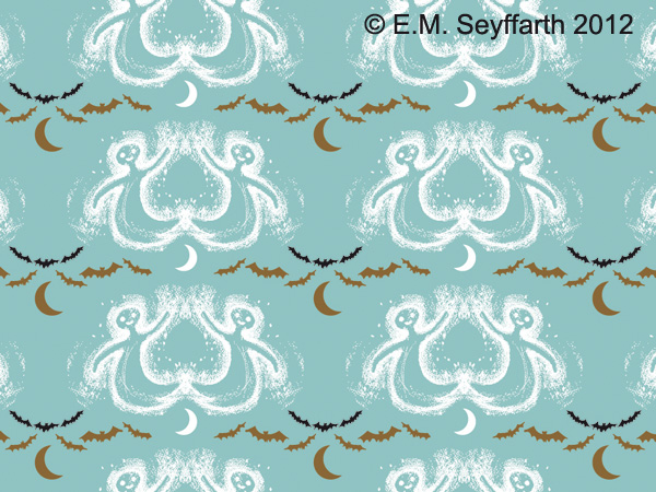
The moon sheds it's pale light on a hazy chorus line of ghosts.
Das fahle Mondlicht scheint auf einen schemenhaften Geistertanz.


Mysterious flowers bloom on the forest floor …
Eigenartige Blumen blühen auf dem Waldboden …


… and flights of bats pattern the sky, sailing away into the Halloween Night …
… und Schwärme von Fledermäusen ziehen ein Muster über den Himmel, 
und segeln weiter in die Halloween-Nacht … 


And here's the whole collection, hope you like it! I was aiming to create a collection with a Halloween mood, leaving the theme it a bit more open at the same time – so that it would go along with anything a bit spooky and mysterious. I really enjoy spooky moments from time to time, and guess there are some more dark souls around who feel the same …

Und hier ist die ganze Kollektion, ich hoffe, sie gefällt! Mein Ziel war es, eine Kollektion für Halloween zu entwerfen, die das Thema gleichzeitig etwas offener läßt – sodaß sie zu allem paßt, was gruselig und mysteriös ist. Ich mag es manchmal ganz gern etwas unheimlich, und denke da draußen gibt es noch mehr dunkle Seelen, denen es genauso geht …