Showing posts with label letters – Schrift. Show all posts

Sunday, 14 May 2017

New stationary designs

Lately I haven't had much time for creating due to family health issues … but somehow, in between things, I managed to do some work for the "Better Together Minted Greeting Card Design Challenge". Would have loved to do more … Oh well ok, I think in times like these the most important thing is to somehow just keep working – in order to keep one's creative muscles relatively fit and healthy.

Today I'll show you some of my submissions to this challenge. It is a contest for both copy and design. One could either work with own copy, or choose copy submitted by another artist and create for that. Something that I loved to do!
Votes and likes would be very welcome! Voting already ends on Monday evening, 15th of May (mid european time) – sorry for the rush! I simply didn't manage to post my designs earlier … Thank you so much for voting and liking!


Lovely Day Flowers

"Lovely Day Flowers" – watercolour floral design  for a birthday card with copy by Jennifer Lew: "Front: Make today lovely/ Inside: Happy Birthday".


"Walk in Flowers"

"Walk in Flowers" is a 21st birthday card featuring a shower of watercolour petals based on my own copy. Front: "May you walk in flowers and dance in the rain." Inside: "With lots of love on your 21st birthday!"


"Sunny Road"

"Sunny Road" is a another 21st birthday card based on my own copy: Front: "Wishing you … wind in your hair, joy in your heart and a sunny road to life's adventures." Inside: "Happy 21st Birthday!"
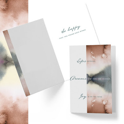


"Entwine"
"Entwine"

"Entwine" is a wedding card design based on a copy by Lisa Sunday Rinella. Front: "Lifes entwine, dreams melt into one another, joy is on the wind." Inside: So happy you found each other." I immediately fell in love with Lisa's words and together with my watercolour details this card makes one of my fave submissions.


"Emerald Isle Blessing"

"Emerals Isle Blessing" – this one is special to me because the copywriter, Mariecor Agravante, chose my photographic art print out of the bounty of designs that are already for sale on Minted and wrote a copy for it specifically to go on a card together. Front: "Emerald Isle Blessing", Inside (excerpt):  "May the mists of the Eirinn isle, bring a glow to your dimpled smile, … And may the wings of Irish laughter, Uplift you now and ever after." Thank you so much, Mariecor!


"My own kind"

"My own kind" – here's a mixed media botanical design that I used for a mother's birthday card featuring copy by Kate Ross. Front: "You've always taught me to be my own kind of beautiful." Inside: "I'm so grateful for you, Mom. I celebrate you on your birthday and always."


"Always Love"

 "Always Love" – this sympathy card features my own photography. The copy is by Courtney Crane. Front: "Though there is loss …, Inside: "love always remains. Thinking of you with heartfelt sympathy."


https://www.minted.com/design-rating/785963?filter=all&sort=designer
"Galactical"

Finally this is a card to send to a loved one: "Galactical". It is based on a copy by Frooted Design. Front: "The moon is way too close." Inside: "Love you to the furthest galaxy and back!"

Want to see more? You can have a look at ALL submissions (3752!) to this challenge over here.
And you can find ALL OF MY submissions using the filter "Sorted by artist" and then hop over to page 71. Thank you!

Monday, 11 April 2016

Spring sunshine mixed with Christmas carols

It's kind of weird to work on Christmas designs when Spring is finally here! But that's what I did last week.
There is a new challenge on at Minted, for Christmas cards. In fact, there are more holiday challenges coming up, so this blog might look a lot like Christmas in the next weeks …

This first holiday contest, the “Oh Come, All Ye Faithful” Religious Christmas Photo Card Challenge is for designs with religious or spiritual themes and greetings. The cards will be personalizable with the customer's name and own photography. There is a foil pressed and a non-foil version of the challenge.

I felt this was not an easy brief but an interesting one. While I am not overly religious I liked the idea of working with a spiritual text. Back to the basics, so to say!
I had to whipe off the dust of my calligraphy brushes – it's been a while that I worked on handlettering and calligraphy – but after some trials I really got into it. I aimed for cards that have a fresh, spontanious, expressive and uplifting look. Here's my three faves! (All photos are courtesy of Minted.)


"Bold Brush Hallelujah"


"5 Blessings"


"Bold Night Divine"

I hope you'll like them!

Votes are very welcome :-) You can vote for the designs in this blogpost just by clicking on the title of the image – the link will lead you directly onto my submission on the Minted page. You as well can have a look and vote for all my designs (6 of them) here on my voting page. Voting is open until Tuesday, April 19. Thank you so much!!!

Wednesday, 29 April 2015

MATS Bootcamp 3 – Global Art Gathering Poster

I am postponing my blogpost about the last week of MATS B … today we are in Bootcamp!
The April assignment was to do a poster for the MATS Global Art Gathering that will take place in Brighton in June. To explain what it's all about I am quoting from the MATS website: "The Global Art Gathering will bring together leading experts from the art industry with artists from all over the world, to explore how to build a flourishing art/design career by making great art that is commercially viable."
You can see the whole gallery of fabulous posters done by the bootcampers here!
And here's my poster:


I loved working on it! Here are a few work in progress pics:

As the briefing asked for a handlettered headline I started with some lettering experiments, and some (a lot of!) scribbled pages later I decided to go for brush lettering as seen above.
I knew I wanted to go for a conceptual poster and wanted to concentrate on what an art conference really is about: sharing knowledge and making connections. It took me a bit to get the right idea for the illustrations. After brainstorming I had a lot of ideas and did a lot of sketches, but didn't like them really … till I had that idea:


I am calling these "Knowlegde Swirl" and "Knowledge Net" :-)


Painting my icons with watercolour …
Then I collaged it all together in Photoshop. Finally I added some line drawings for showing the venue (the Brighton Dome) and adding a bit of a seaside athmosphere. I like these little details:


Lilla Rogers and the MATS team will now pick one poster that will actually be used for the event. There's almost 300 fab posters in the gallery – I guess they will have a pretty hard time with their selection!

Friday, 24 April 2015

MATS B, 4 – Editorial

In week 4 of MATS B we learned about the market for editorial illustration and had to create a map of our hometown or surroundings, as if it was an illustration for the travel section of a magazine.
I live in a region with lots of history and old castles around, so I went all medieval! And like in the week before, I had a lot of hand lettering practise and my old nib pen came handy again :-)
Here is my finished map:

In der vierten Woche von MATS B lernten wir den Markt für Editorial (Zeitschriften-Illustration) kennen. Als Aufgabe sollten wir eine Karte unserer Heimatsstadt oder unserer Umgebung als Illustration für den Reiseteil einer Zeitschrift anfertigen.
Ich lebe in einer Region mit viel Geschichte und vielen Schlössern und Burgen, und deshalb wurde es bei mir richtig mittelalterlich … Und wie auch schon in der Woche davor konnte ich wunderbar Schriften zeichnen üben. Meine alte Zeichenfeder kam wieder zu neuen Ehren :-)
Hier ist meine Karte:


I loved trying out medieval style lettering! 
Es hat mir viel Spaß gemacht, Schrift im mittelalterlichen Stil auszuprobieren.


The Lahn River Valley is a bit like a mini version of the Rhine River Valley, so there's lots to see. It's well worth a visit – and I hope my map is a nice little taster!

Das Lahntal ist so ein bißchen wie eine Miniversion des Rheintals, und es gibt viel zu sehen. Es ist wirklich einen Besuch wert – ich hoffe, meine Karte kann dafür einen kleinen Vorgeschmack liefern!

Wednesday, 15 April 2015

MATS B, 3: Scrapbooking

 
The third MATS week's topic was the scrapbooking market. Not my cup of tea really … although I shouldn't say so, it's rather that I don't know if I like it or not? Scrapbooking is almost non existent in Germany. But really loved the theme: vintage correspondence combined with airships, oh wow!
Normally I prefer the paint brush over the fine liner … but this time round I stumbled upon an old nib pen that I hadn't used for a long time. And then really enjoyed drawing wonky ships and balloons with pen and ink. Learning: well I do like drawing, I simply have to make it interesting by using different/ unusual materials! 


In der dritten MATS-Woche ging es um den Scrapbooking-Markt. Eher nicht so mein Ding … obwohl ich das so nicht sagen sollte! Es geht mehr darum, daß ich nicht weiß, ob ich den Markt gut finde oder nicht? Scrapbooking gibt es Deutschland fast garnicht. Das Thema hat mir aber sehr gut gefallen: Nostalgische Korrespondenz kombiniert mit Luftschiffen, wow!
Nomalerweise greife ich ja immer zum Pinsel anstatt zum Fineliner … aber diesmal hatte ich eine alte Zeichenfeder wiederentdeckt, die ich lange nicht mehr benutzt hatte. Und es hat mir viel Spaß gemacht, damit eine ganze Flotte von schrägen Luftschiffen und Fesselballons zu zeichnen. Merke: zeichnen mag ich schon, ich muß es mir nur schmackhaft machen, wie in diesem Fall durch ungewöhnliches Zeichengerät!

Ok, and then I got my paintbrush out :-) This is as far as I got with my collection:
Ok, und dann habe ich meine Pinsel doch noch ausgepackt :-) Und soweit bin ich mit meiner Kollektion gekommen:

I especially like the dreamy atmosphere. And think it is well worth finishing. Well it might not end up in the scrapbooking market but it might make a nice set of greeting cards … or a journal cover? Or I can see it for a fabric collection as well! 
Die verträumte Atmosphäre gefällt mir hier besonders gut. Und ich glaube, es ist es wert, fertiggestellt zu werden. Wahrscheinlich landet es nicht im Scrapbooking-Markt. Aber es könnte eine schöne Grußkarten-Serie daraus werden … oder ein Notizbuch? Und ich kann es mir auch als Stoffkollektion vorstellen!


That's it for today … and in the next post I will show you something finished! Promised :-)
So, das war's für heute … und im nächsten Post werde ich etwas Fertiges zeigen! Versprochen :-)

Wednesday, 4 February 2015

Words and letters 3: Art Manifesto, part 1... Kunst-Manifest, Teil 1


This was originally part of a contest, from Lilla Rogers Studio School, with the topic "Art Manifesto". But unfortunately, I wasn't able to finish it on time as other work got in the way. But it fits very well with my "Words and Letters" series and I had lots of fun designing and drawing it. The manifesto is handdrawn and part 2 and 3 will follow in near future :-)

Ursprünglich war dies Teil eines Wettbewerbes, von der Lilla Rogers Studio School, zum Thema "Kunst-Manifest". Doch unglücklicherweise bin ich nicht rechtzeitig fertig geworden weil andere Jobs dazwischenkamen. Es passt aber gut in die "Words and Letters"-Serie und ich hatte sehr viel Spaß dabei es zu designen und zu zeichnen. Das Manifest ist handgezeichnet und Teil 2 und 3 werden in naher Zukunft folgen :-)

Friday, 30 January 2015

MATS Bootcamp 1: Jewel Days journals … Jewel Days Tagebücher


It's that time again: Lilla Rogers' MATS Bootcamp has started – here's my first design!
The assignment for January was to do a journal design inspired by Edwardian brooches. I quickly fell in love with the cameo jewellery that was fashionable in that period.
Here's some of my sketches of romantic Cameo ladies.

Es ist wieder soweit: Lilla Rogers' Bootcamp hat wieder angefangen – hier ist mein erstes Design!
Die Januar-Aufgabe war es, ein Tagebuchcover inspiriert von Broschen aus Edwardianischer Zeit (das entspricht unserem Jugendstil) zu entwerfen. Ich habe mich sofort in die für diese Zeit typischen Kameenbroschen verliebt.
Hier sind einige Skizzen der romantischen Kameen-Damen.

As I wanted my design to have a loose, light and romantic quality I started experimenting with watercolour and gouache. And loved these dot paintings. They look a bit like flowers which goes nicely with the romantic feel but they were initially inspired by some brooches studded with lots and lots of little glittering gems.

Mein Design sollte locker, leicht und romantisch werden, und so experimentierte ich mit Aquarellfarben und Gouache. Und blieb an diesen Tupfenmustern hängen. Sie sehen ein bißchen wie Blumen aus, was gut zur romantischen Stimmung paßt. Ursprünglich aber waren sie von Broschen inspiriert, die über und über mit glitzernden Steinen besetzt sind.


And here's one of the Cameo ladies in gouache paint …
Und hier ist eine der Kameen-Damen in Gouache …


I then assembled it all together and added some handlettering – like seen in my previous post – and my journals were ready.

Nun mußte ich nur noch alles zusammensetzen. Und es kam noch Text dazu – den Sie ja aus meiner letzten Blogpost schon kennen – und meine Tagebücher waren fertig.


Please take a look at the Bootcamp Gallery on the Lilla Rogers' Site as well! Like last year I am very much impressed by variety of interpretations and styles of my classmates. There's lots and lots of beautiful jewellery inspired designs to see!

Werfen Sie auch einen Blick in die Bootcamp Gallerie auf der Lilla Rogers' Website – es lohnt sich! Wie letztes Jahr auch schon bin ich auch diesmal ganz schön beeindruckt von all den verschiedenen Stilen und Interpretationen meiner Kommilitonen. Es gibt dort wirklich viele schöne "Schmuck"-Designs zu sehen!

Tuesday, 27 January 2015

Words and Letters 2: Jewel days … Juwelentage


Every single day is precious. Sure there are always darker and downright nasty days when I keep forgetting this … but generally I do believe that our time on earth should be celebrated!
My handlettering was done with a brush and gouache. It is part of a bigger project that I will probably show here on the blog a bit later on in the week. And I am happy to report that this time I didn't try to navigate around using words like before but dived right into it :-)

Jeder Tag
ist kostbar. Klar gibt es immer wieder dunkle und eklige Tage an denen ich das vergesse … aber im Großen und Ganzen glaube ich daran, daß unsere Zeit hier auf Erden gefeiert werden sollte!
Der Spruch ist mit Pinsel und Gouache geschrieben. Er ist Teil eines größeren Projektes, das ich wohl Ende der Woche hier im Blog zeigen werde. Und ich kann sagen, daß ich diesmal nicht versucht habe, mich irgendwie um die Kalligraphie zu drücken, sondern mich gleich drauf gestürzt habe :-)

Monday, 12 January 2015

Words and letters: getting started … Wort und Schrift: los geht's!

Ok, as I'd decided to explore handlettering this year I better start with it before all the new year's energy is gone! "Words and letters" might get a weekly blog-feature for this year … maybe … let's see …
I thought I'd start with my word of the year 2015: clarity. After some experimentation this is what I came up with.


No sure if it's any good … yet… Handlettering is very new to me, and I still have to feel my way into it. But there's one thing I know already: I want my lettering to be more than just decorative – I want it to be true to what the words say. So for clarity I thought about translucent watercolours, and I used handcut letters so that it looks crisp and clear. And tried to make "welcome" really wide open and welcoming.
I loved the experimenting. Looking forward to try out more soon!

Ok, weil ich ja beschlossen habe, daß ich dieses Jahr mit handgemachten Schriften arbeiten möchte, fange ich am besten gleich damit an – bevor die ganze Neujahrsenergie wieder verpufft ist! "Wort und Schrift" könnte dieses Jahr eine regelmäßige Serie hier im Blog werden … vielleicht … mal sehen …
Ich dachte mir, ich fange gleich mit meinem Wort des Jahres 2015 an: clarity (Klarheit). Und nach ein bißchen rumexperimentieren ist dies hier entstanden.
Ich bin mir noch nicht so recht sicher, ob es gut ist oder nicht … Handgemachte Schriften sind Neuland für mich, und so muß ich mich erst langsam rantasten. Aber eins weiß ich schon: ich möchte, daß meine Schriften mehr sind als nur dekorativ – sie sollen den Worten wirklich entsprechen. Also benutzte ich für "Klarheit" durchscheinende Aquarellfarben. Die Schrift selbst ist geschnitten, damit sie klar und knackig ist. Und ich habe versucht "welcome" wirklich offen und einladend aussehen zu lassen.
Das Experimentieren hat Spaß gemacht. Ich freue mich schon auf mehr! 


P.s.: Played a bit on with this this morning … so I am adding some more versions …
P.s.: Ich habe heute morgen noch ein bißchen damit rumgebastelt … hier sind noch einige weitere Versionen …